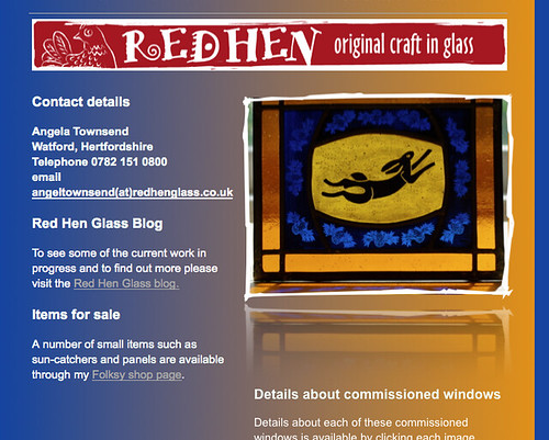
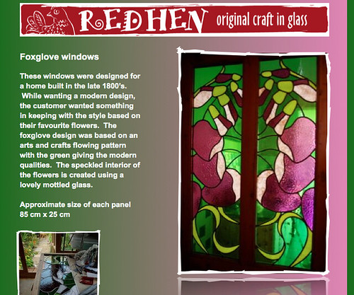
Well, it's that time of year when I take some time away from making and try to remember just how to edit and upload some new pages and images for my website www.redhenglass.co.uk Feeling inspired, I played around with matching the page backgrounds to the glass images and while this was a lot of fun, you might agree that it is all a bit too bright and difficult to read. Do please let me know if you think otherwise, but have to say, while it was enjoyable, I may return to something a little more sober even if it is to make the pictures show up more strongly. But for perhaps a limited period only, here is the rather bright website.


No comments:
Post a Comment